This is the name of the iphone app I supplied images for. Nooo - not of me silly! I’ll explain…
This is back in November 2009 (yes I know allot of catching up to do) My mate Charlie has got into iphone application development which is really exciting stuff and is doing quite well with it too. He asked me if I would like to provide the photos for his latest app. Each photo would need represent each of the female and male attributes included in the app.
The Creative Brief
So after Charlie had given me the design brief, we had to come up with the ideas for the images..
For Her:
Her hip waist ratio…okay easy, that would be a apple and/or pear with tape measure
Her BMI…picture of scales
Her breast size…er apart from the obvious - we are not going there…just sticking to a photos of brassieres
Her Age…hmmm, a bit more difficult but could only think of wine or tree rings
Her hair colour…again quite difficult- but could only think of hair dye samples you get in the hairdressers
And for him..
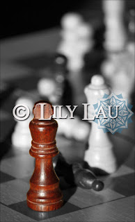
His Intelligence…light bulb or chess set
His Generosity…chocolates, or flowers or gift of sorts
His Wealth…stack of money
His Height…this pic was already sorted so I didn’t need to worry about this one
His Shoulder Waist ratio…this was also sorted
The homepage…
Charlie suggested a picture of a peacock would be ideal….and I thought, well that’s going to be difficult to get an original picture of a bird like that. But it just so happened that I had a picture of such a beauty taken one of my travels to Barcelona with my dad when we ran out of things to do and went to the zoo
It was also an opportunity to learn how to use photoshop
Variations
This is the original picture:
Then I learnt a little bit more on photoshop…mirror image of bird and transposing the image…
then I learnt how to play around with layers and erasing the top layer to reveal the colour on the bottom layer and also smudging to get the water ripple affect….
***********************************
Splash of Colour
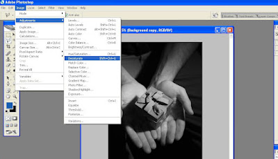
After have a few ideas with the images and shots, Charlie had the great idea to have the images in black and white but only show the chosen object as its original colour. Which means more photoshop functions to learn…awesome…
This is one of the ideas for His Generosity and I will talk through how I did this in the end. I used Adobe Photoshop CS2 (yup I’m waaay behind) I believe there is Photoshop CS5 out now
Here is the shot I took which I cropped. Then made another layer (copy of this picture) by clicking and dragging the Background to the Create New Layer icon
Then using the Polygonal Lasso Tool….

I used this to draw round the object I wanted to retain the original colour

I used this to draw round the object I wanted to retain the original colour
Once the shape was highlighted, you just select Edit>Cut to get rid of the object you have just outlined and the bottom (coloured) layer will appear!!
This is what you get…
Interpretations
Here are some more test ideas. The apple was actually a red apple, but I played with the hue/saturation to make it green
 |
Download the App
Available on itunes store now. Download to see the final images used


No comments:
Post a Comment